
항상 변화하는 웹 개발 세계에서 웹 애플리케이션을 만들고 원활한 사용자 경험을 구축하려면 보기 좋은 외적 디자인에 그치지 않고 전체적으로 효율적이고 일관적인 애플리케이션 디자인이 필요하다.
디자인 시스템을 갖추면 다양한 프로젝트에서 사용할 수 있는 일관성 있고 재사용 가능한 UI 컴포넌트를 쉽게 만들 수 있다. 디자인 시스템은 재사용 가능한 UI 컴포넌트와 디자인 토큰의 집합이다. 이러한 토큰은 버튼, 색상 및 글꼴과 같은 것을 포함하는 컴포넌트와 같다. 모든 프로덕트에 일관된 UX를 제공하여 매력적인 UX를 만드는 것이 목표다.
🥲 기존의 버튼 컴포넌트
1번 컴포넌트
interface ButtonProps {
  label?: string;
  onClick?: (e: React.MouseEvent<HTMLButtonElement>) => void;
  outline?: boolean;
  small?: boolean;
  type?: any;
  disabled?: boolean;
}

export default function Button({
  label,
  onClick,
  type,
  outline,
  small,
  disabled,
}: ButtonProps) {
  return (
    <button
      onClick={onClick}
      type={type}
      disabled={disabled}
      className={`relative rounded-md hover:opacity-80 transition disabled:cursor-not-allowed ${
        outline ? "bg-black" : "bg-vercel-white w-full"
      } ${outline ? "text-white" : "text-black"} ${small ? "py-1" : "py-3"} ${
        small ? "text-sm" : "text-lg"
      } ${small ? " border-[1px]" : "border-2"}`}
    >
      {label}
    </button>
  );
}
2번 컴포넌트
import { IconType } from "react-icons";
import { twMerge } from "tailwind-merge";

interface ButtonProps {
  label?: string;
  onClick?: (e: React.MouseEvent<HTMLButtonElement>) => void;
  disabled?: boolean;
  outline?: boolean;
  small?: boolean;
  icon?: IconType;
  iconColor?: string;
  size?: number;
  htmlType?: React.ButtonHTMLAttributes<HTMLButtonElement>["type"];
  loading?: boolean;
  children?: React.ReactNode;
  style?: string;
}

export default function Button({
  label,
  onClick,
  disabled,
  outline,
  small,
  icon: Icon,
  size,
  htmlType = "button",
  loading,
  iconColor,
  children,
  style,
}: ButtonProps) {
  const buttonClasses = twMerge(`
  disabled:opacity-70
  disabled:cursor-not-allowed
  rounded-md
  hover:opacity-80
  transition
  border-neutral-700
  flex items-center justify-center gap-2
  ${outline ? "bg-white" : "bg-neutral-800"}
  ${outline ? "text-neutral-900" : "text-white"}
  ${small ? "text-base" : "text-md"}
  ${small ? "py-1 px-2" : "py-3 px-4"}
  ${small ? "font-light" : "font-semibold"}
  ${small ? "border-[1px]" : "border-2"}
  ${style ? style : ""}
`);

  return (
    <button
      disabled={disabled}
      onClick={onClick}
      type={htmlType}
      className={buttonClasses}
    >
      {Icon && <Icon color={iconColor} size={size ? size : 24} />}
      {label}
      {children}
    </button>
  );
}
위 두 버튼 컴포넌트는 중복을 포함하고 있고, 같은 버튼이지만 따로 관리되며 스타일을 추가하기엔 복잡한 구조를 가지고 있다. 두 버튼 컴포넌트를 재사용 가능하고 커스텀할 수 있는 하나의 컴포넌트로 만들어보자.
CVA(Class Variance Authority)
설치
npm i class-variance-authority
CVA란?
공식 문서: "전통적인" CSS 접근 방식으로 variants(UI 컴포넌트가 가지는 스타일이나 상태)을 만드는 것은 수동으로 클래스를 props에 연결하고 컴포넌트의 유형을 직접 수동으로 추가하는 것과 같이 번거로운 작업이 될 수 있습니다. cva는 이러한 고통스러운 점들을 제거하여 UI 개발의 더 재미있는 측면에 집중할 수 있게 도와줍니다.
간단히 말하자면, 스타일 관리를 단순화하는 간단하고 실용적인 라이브러리이다.
전통적인 접근 방식의 예
export const TraditionalButton = ({ variant, children }) => {

  let buttonClass = "flex justify-center items-center h-14 w-full border rounded-md px-3 font-semibold";

  if (variant === 'primary') {
    buttonClass += " bg-amber-600 text-white";
  } else if (variant === 'secondary') {
    buttonClass += " text-neutral-900 border-neutral-900";
  }

  return (
    <button className={buttonClass}>
      {children}
    </button>
  );
};기존 방식에선 클래스를 수동으로 연결하여 유지 보수가 힘들고 복잡하다. 이러한 방식은 특히 다양한 스타일을 필요로 하는 수많은 컴포넌트가 있는 대규모 프로젝트에는 적절하지 않다.
interface ButtonProps {
  size?: "tiny" | "small" | "medium" | "large" | "xlarge";
  type?: "default" |"primary"| "dark";
  rounded?: boolean;
  ...
  }

  // button 컴포넌트

if (size) buttonClasses.push(__styles.size[size]);
if (type) buttonClasses.push(__styles.type[type]);
if (rounded) buttonClasses.push(__styles.rounded);전통적인 방법에서 위와 같이 개선된 컴포넌트를 만드려 했지만 cva를 사용하면 더욱 효율적인 버튼 컴포넌트를 구축할 수 있다는 것을 확신했다.
CVA의 장점
- 단순: 스타일 전환이 간단하다.
- 가독성: 스타일링 로직이 버튼 스타일 내에서 깔끔하게 캡슐화되어 컴포넌트 구조를 더욱 체계화하고 읽기 쉽게 만든다.
- 확장성: 스타일을 추가하거나 수정하는 것이 훨씬 간단하다.
시작하기
우선 props를 통해 버튼을 조작할 수 있는 variants를 추가해 보자.
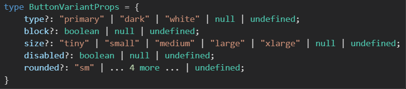
export type ButtonVariantProps = VariantProps<typeof buttonVariants>;
const buttonVariants = cva(
  `
  relative
  flex items-center justify-center
  cursor-pointer
  outline-none
  transition-all
  space-x-2
  border
  `,
  {
    variants: {
      type: {
        primary: `
        bg-[#cc8925] hover:bg-[#cc8925]/70
        text-white
        border-[#ffd83d]
        focus-visible:outline-brand-600
        shadow-sm`,
        dark: `
        bg-neutral-800 hover:bg-neutral-800/80
        text-white
        border-neutral-700
        shadow-sm
        `,
        white: `
        bg-vercel-white hover:bg-vercel-white/80
        text-neutral-900
        shadow-sm
        `,
      },
      block: {
        true: "w-full flex items-center justify-center",
      },
      size: {
        ...sizes,
      },
      disabled: {
        true: "opacity-60 cursor-default",
      },
      rounded: {
        sm: "rounded-sm",
        md: "rounded-md",
        lg: "rounded-lg",
        full: "rounded-full",
      },
    },
  }
);cva는 variant 타입을 추출할 수 있는 VariantProps helper를 제공한다.
cva의 첫 번째 인수로 기본 스타일을 작성하고, 두 번째로 variants 객체를 정의했다. 버튼을 랜더링 할 때 props로 전달한 type에 따라 정의된 스타일이 적용된다.
export interface ButtonProps
  // 'type' 속성을 제외한 나머지 모든 속성
  extends Omit<React.ButtonHTMLAttributes<HTMLButtonElement>, "type">,
    // 'disabled'는 이미 HTMLButtonElement에 포함되어 있기에 제외
    Omit<ButtonVariantProps, "disabled">,
    LoadingVariantProps {
  icon?: IconType;
  iconSize?: number;
  iconColor?: string;
  type?: ButtonVariantProps["type"];
  htmlType?: React.ButtonHTMLAttributes<HTMLButtonElement>["type"];
}이 interface는 버튼 컴포넌트가 받는 props를 정의하는 데 사용된다. variant 타입을 추출한 ButtonVariantProps를 ButtonProps에 확장하여 사용하고 있다(여기선 Omit으로 disabled 속성은 제외함). 이렇게 하면 위에서 선언한 buttonVariants의 variants 객체가 버튼 컴포넌트의 props 타입으로 지정되는 것이다.
TSX
    return (
      <button
        type={htmlType}
        className={cn(
          buttonVariants({ type, size, disabled, block, rounded }),
          className
        )}
        {...props}
      >
        {showIcon && <Icon color={iconColor} size={iconSize ? iconSize : 24} />}
        {children && <span className={"truncate"}>{children}</span>}
      </button>
    );
버튼의 className 속성을 살펴보자. (cn 함수에 대해선 아래에 정리)
className은 buttonVariants 함수를 활용하여 type, size, disabled, block, rounded와 같은 props를 구조 분해하여 동적으로 설정하고 있다. 이를 통해 버튼에 대한 스타일링이 유연하게 조절된다.
유연한 스타일링을 제공하는 재사용 가능한 버튼 컴포넌트를 만들었다.
아래는 cn 유틸리티 함수에 대한 설명이다.
cn
cn 함수는 React와 Tailwind CSS를 함께 사용하는 환경에서 className을 다루기 쉽게 해주는 helper 유틸리티이다. 이 함수는 className을 적절하게 병합하고 충돌을 해결하여 컴포넌트 스타일링을 더 일관되고 유지보수하기 쉽게 만든다.
import { ClassValue, clsx } from "clsx";
import { twMerge } from "tailwind-merge";

export function cn(...inputs: ClassValue[]) {
  return twMerge(clsx(inputs));
}
cn을 사용하는 이유
문제 1
type ButtonProps = React.ButtonHTMLAttributes<HTMLButtonElement>;

export default function Button({ className }: ButtonProps) {
  return (
    <button className={`bg-blue-500 text-white p-2 rounded`}>Submit</button>
  );
}props로 받은 스타일을 적용하기 위해서 어떻게 할까? 보통은 템플릿 리터럴을 이용하여 스타일을 적용하려 할 것이다.
<button className={`${className} bg-blue-500 text-white p-2 rounded`}>Submit</button>
하지만 이는 작동하지 않는다. "아! 앞에서 선언한 스타일보다 뒤에 선언한 스타일의 우선순위가 높아 덮어씨워지는 구나" 라며 className을 맨 뒤에 선언해 볼 것이다.
<button className={`bg-blue-500 text-white p-2 rounded ${className}`}>Submit</button>이렇게 하면 원하는 결과를 기대할 수 있을 거라 생각하지만 그렇지 않다. 이를 해결하기 위해 tailwind-merge 라이브러리를 사용한다.
npm i tailwind-merge
<button className={twMerge("bg-blue-500 text-white p-2 rounded", className)}>Submit</button>이를 통해 기본 스타일을 props를 통해 변경할 수 있게 된다.
문제 2
export default function Button({ className }: ButtonProps) {
  const [pending, setPending] = useState(false);

  return (
    <button
    className={twMerge(
      "bg-blue-500 text-white p-2 rounded",
      className,
      pending && "bg-gray-500"
    )}
  >
    Submit
  </button>
  );
}conditional class를 추가하여 pending이 true일 때의 색상을 변경하도록 할 수 있다.
  <button
    className={twMerge(
      "bg-blue-500 text-white p-2 rounded",
      className,
      {
        "bg-gray-500": pending,
      }
    )}
  >
    Submit
  </button>
스타일과 처리할 조건이 많을 때 읽고 추적하기 쉽도록 객체 표기법을 쓰기도 한다. 하지만 twMerge는 이를 지원하지 않기에 clsx 라이브러리를 사용한다.
clsx는 조건부로 클래스를 결합하는 간단한 JavaScript 유틸리티로 CSS 모듈이나 Tailwind CSS와 같은 CSS 솔루션의 복잡한 스타일을 처리할 수 있는 구문을 제공한다.
// EXTRACTED FROM https://github.com/lukeed/clsx
import clsx from 'clsx';

// Strings (variadic)
clsx('foo', true && 'bar', 'baz');
//=> 'foo bar baz'

// Objects
clsx({ foo:true, bar:false, baz:isTrue() });
//=> 'foo baz'

// Objects (variadic)
clsx({ foo:true }, { bar:false }, null, { '--foobar':'hello' });
//=> 'foo --foobar'

// Arrays
clsx(['foo', 0, false, 'bar']);
//=> 'foo bar'

// Arrays (variadic)
clsx(['foo'], ['', 0, false, 'bar'], [['baz', [['hello'], 'there']]]);
//=> 'foo bar baz hello there'

// Kitchen sink (with nesting)
clsx('foo', [1 && 'bar', { baz:false, bat:null }, ['hello', ['world']]], 'cya');
//=> 'foo bar hello world cya'
// 조건에 따른 두가지 표현
clsx('classes', cond1 && 'classes classes1 classes2', cond2 && cond3 && cond4 && '...')

clsx('classes', {
    'classes classes1 classes2': cond1,
    '...': cond2 && cond3 && cond4
})clsx를 이용하여 조건을 객체 구문 표현 스타일을 적용할 수 할 수 있게 된다.
'개발자의 공부 > React' 카테고리의 다른 글
| Zustand with TypeScript (0) | 2024.04.04 |
|---|---|
| React Hook Form을 이용하여 폼 관리(+ zod, ts, nextjs13) (0) | 2023.11.22 |
| 이미지 최적화에 대한 명확한 가이드 (0) | 2023.02.01 |
| 프론트엔드 최적화 시도 - 1 (0) | 2023.01.30 |
| [React]useRef (0) | 2023.01.28 |